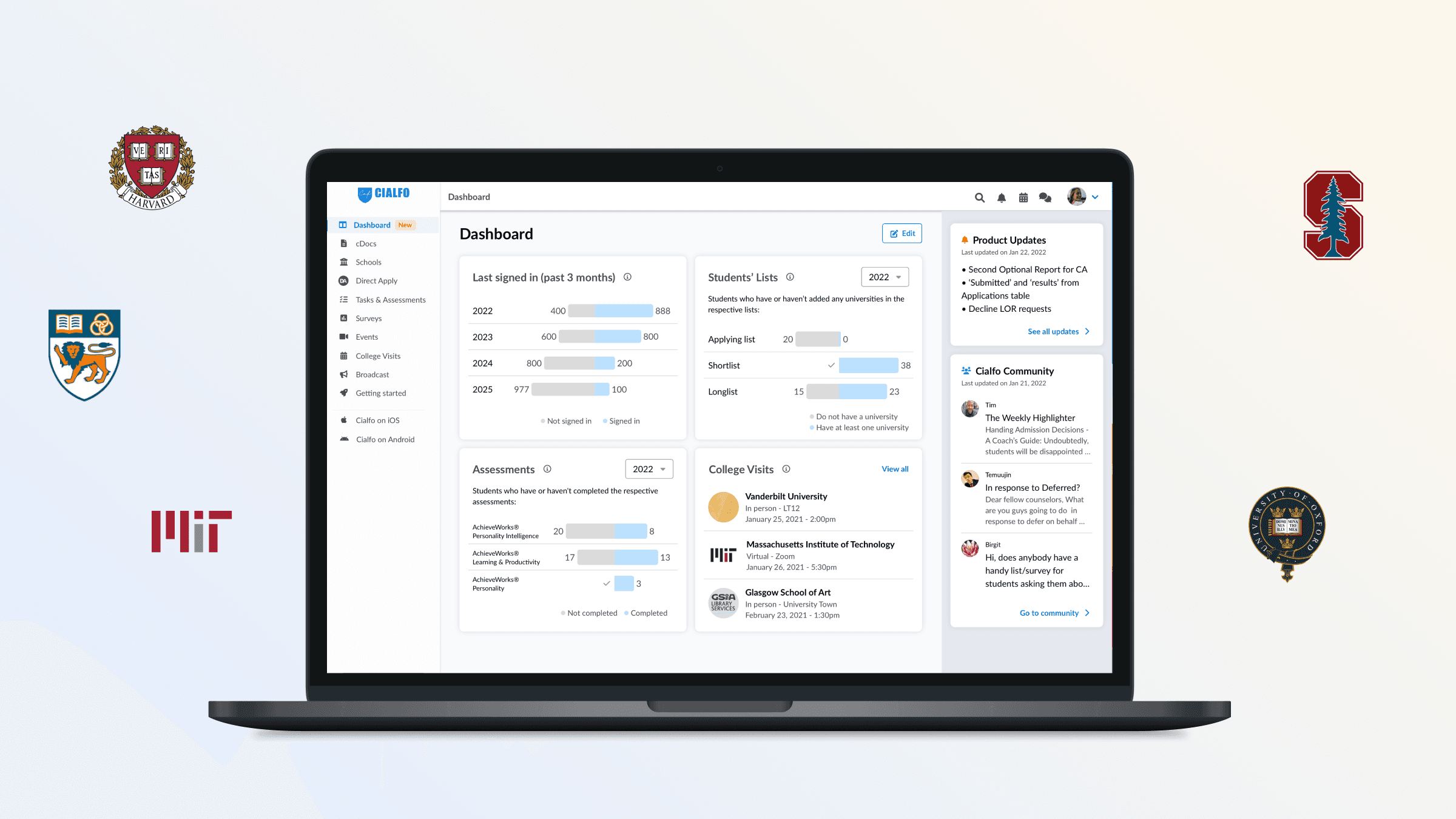
The dashboard project originated from a product and business need for an overview (phase 1) and evolved to address core user goals (phase 2).
My Role
UX research
UX design
Team
1 designer
1 engineer
1 product maanger
Timeline
4 months (2 phases)
Company
Cialfo
Phase 1
Phase 2
Problem statement
As our product grew, features were added in bits and was getting overwhelmingly crowded...
How can we make sense of all the useful features we have built thus far?
Research
To have an idea on what the dashboard should consist of, I conducted secondary research to understand my users’ workflows and pain points. Here are the key findings:
Finding #1
Counselors have to juggle many tasks which vary from month to month
Finding #2
The platform has become cumbersome with new (but useful) features being added over the years
From the above research, I generated a few sketches for discussion. The group consisted of 5 counselors from different regions of the world (for inclusivity of the design)
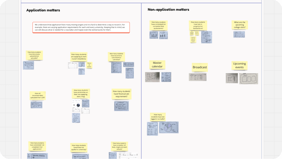
A section where the users can add any suggestions was included. This acts as the bottom net that catches ideas that were outside of what I knew.

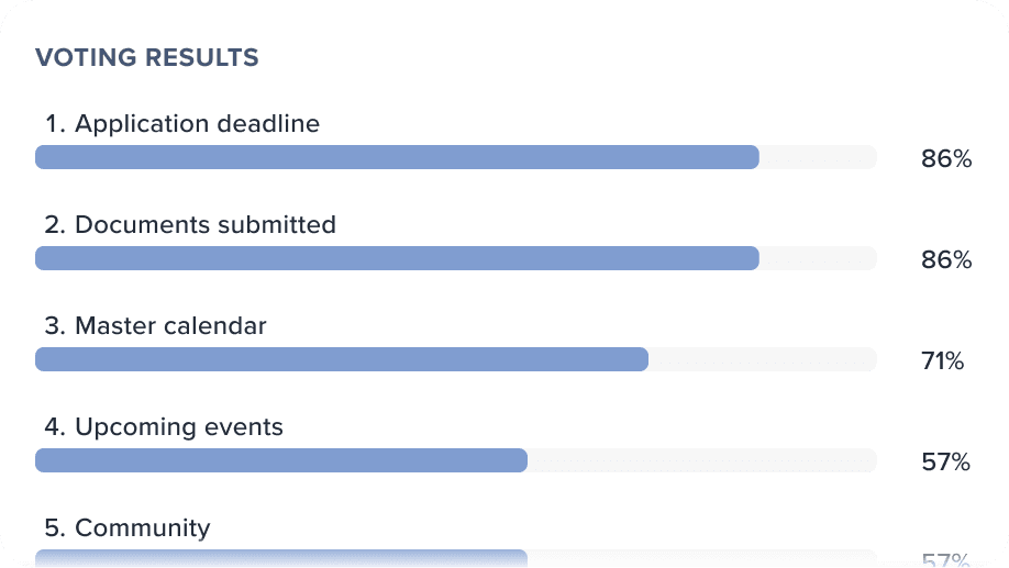
An anonymous voting session was conducted at the end - to highlight which features were preferred. This serve as the list of features that we would do in phases.
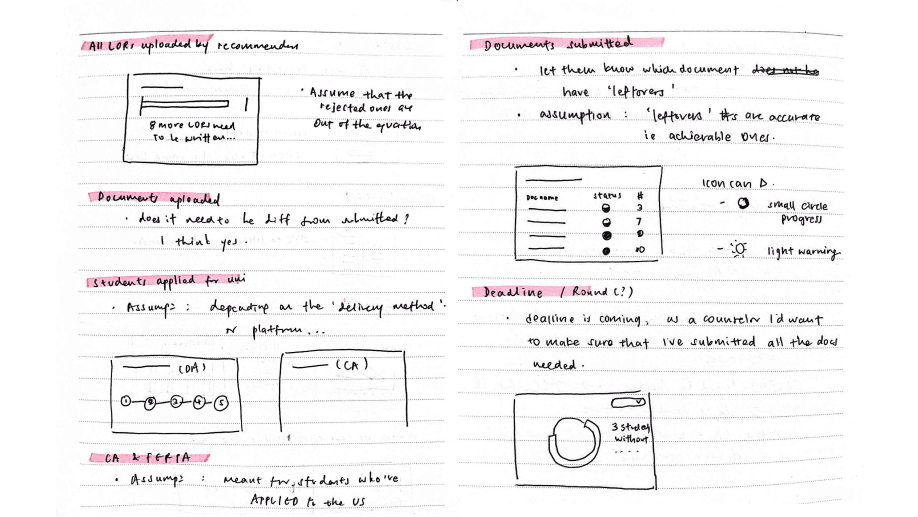
Did some wireframes before doing it in high fidelity
Build
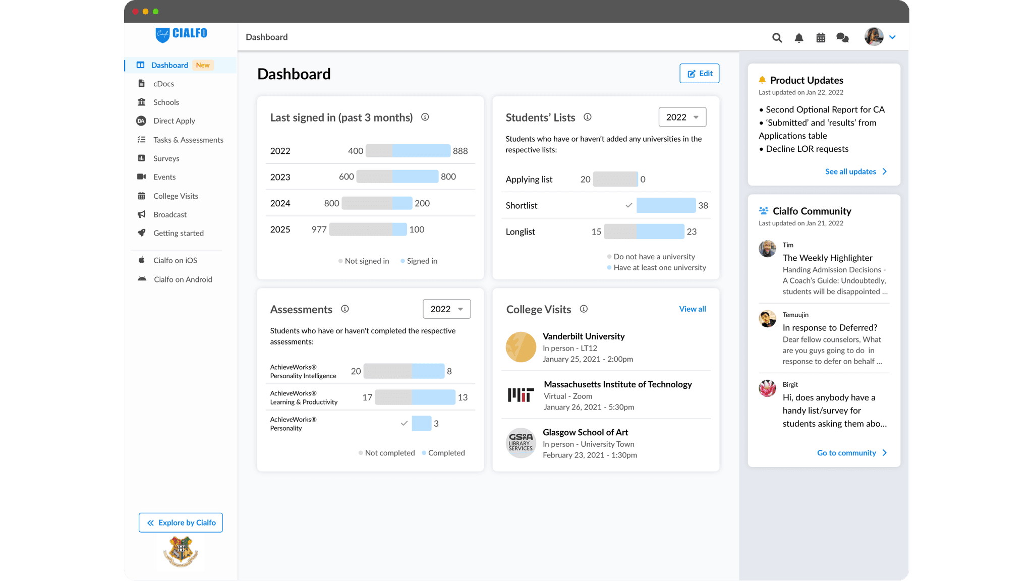
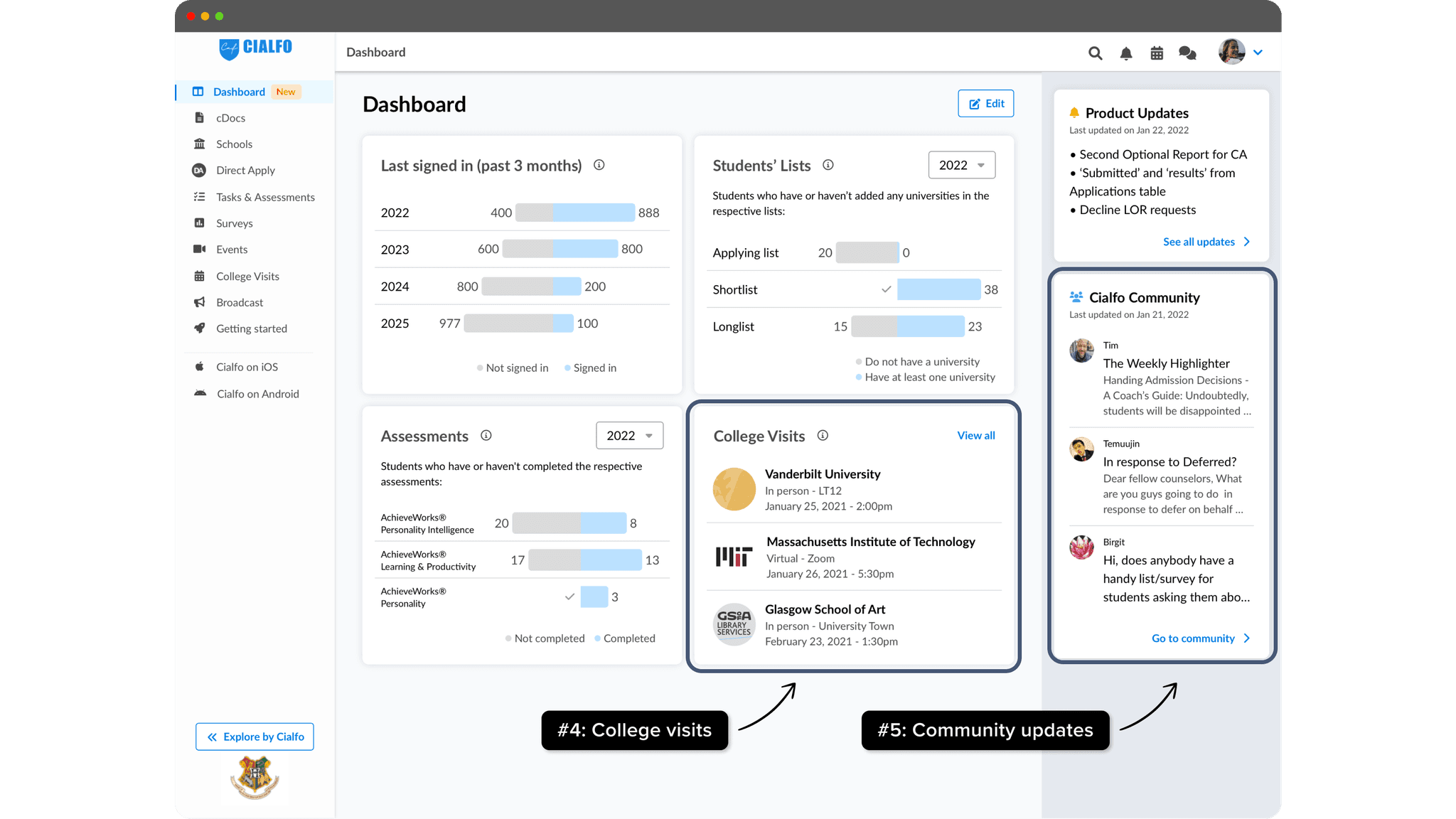
During development, the school application phase had not yet started. To make the best use of our time, we prioritised implementing other features (down the list) that could be utilised immediately upon completion.
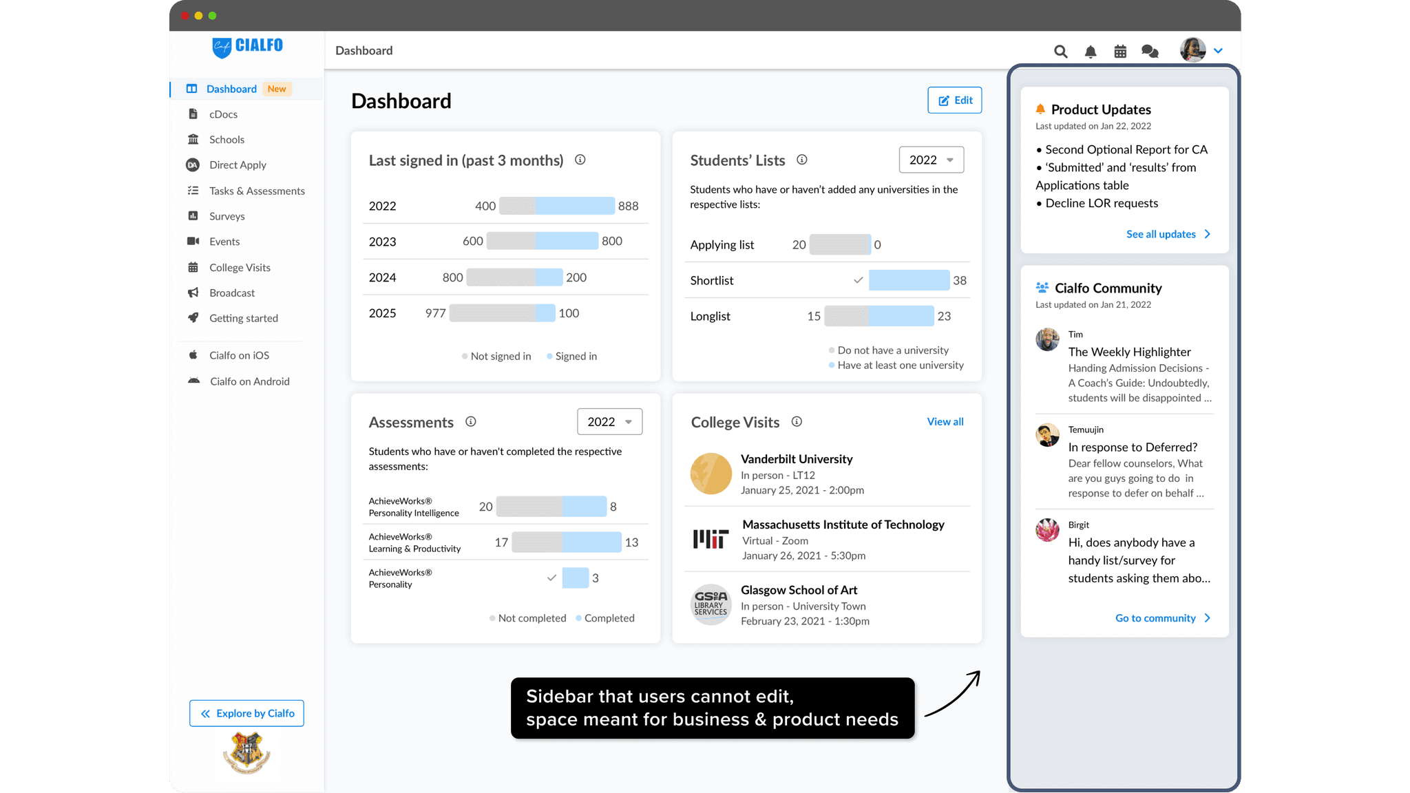
We also created a dedicated sidebar to address both business and product needs.
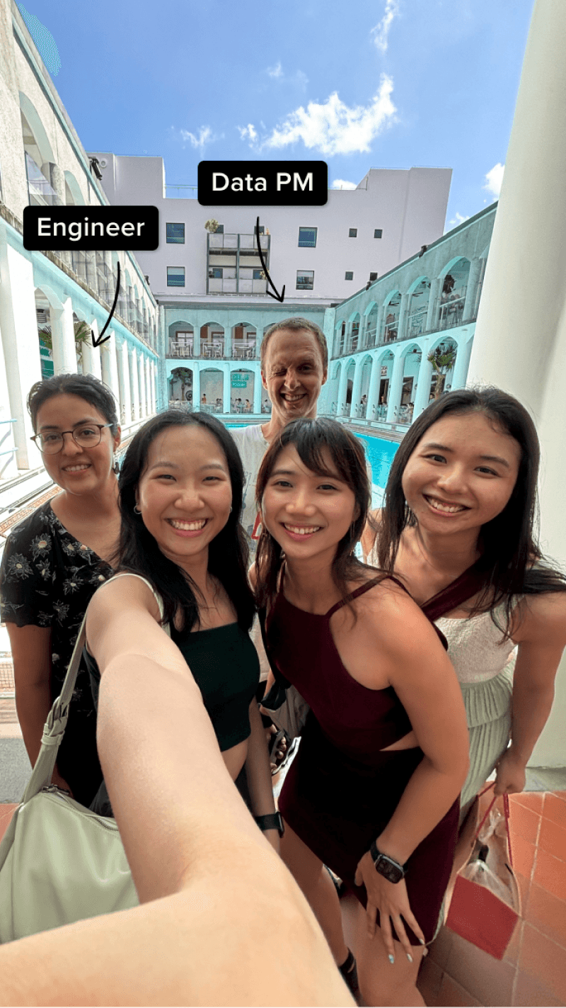
Here’s a funny story: I forgot to notify my engineer about a discrepancy between the design and the code in time, which led to a mini “cat fight” 😆. But no worries—all was resolved, as you can see from our picture together when I visited her in China!
Phase 1
Phase 2
Problem statement
As our product grew, features were added in bits and was getting overwhelmingly crowded...
How can we make sense of all the useful features we have built thus far?
Research
To have an idea on what the dashboard should consist of, I conducted secondary research to understand my users’ workflows and pain points. Here are the key findings:
Finding #1
Counselors have to juggle many tasks which vary from month to month
Finding #2
The platform has become cumbersome with new (but useful) features being added over the years
From the above research, I generated a few sketches for discussion. The group consisted of 5 counselors from different regions of the world (for inclusivity of the design)

A section where the users can add any suggestions was included. This acts as the bottom net that catches ideas that were outside of what I knew.
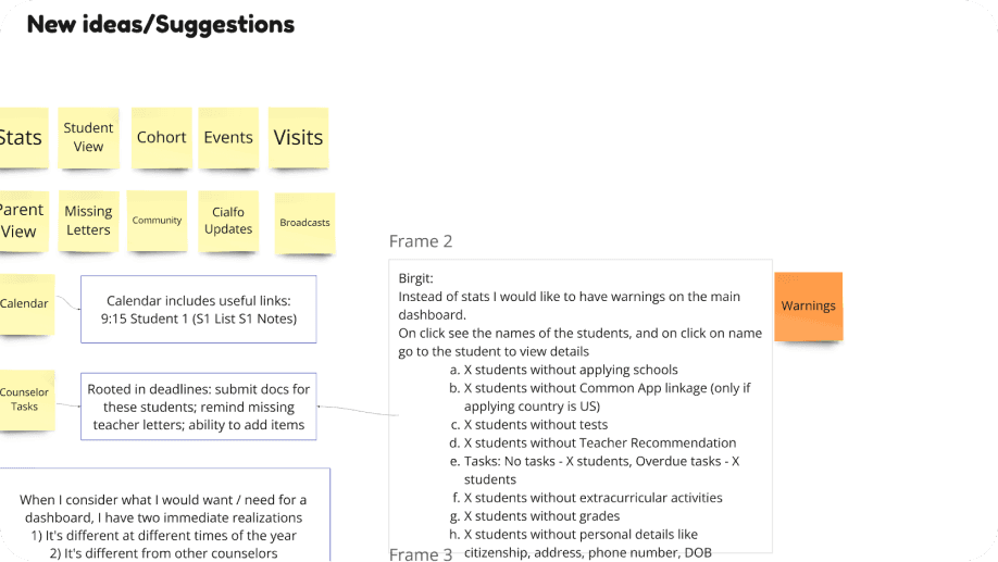
An anonymous voting session was conducted at the end - to highlight which features were preferred. This serve as the list of features that we would do in phases.

Did some wireframes before doing it in high fidelity

Build
During development, the school application phase had not yet started. To make the best use of our time, we prioritised implementing other features (down the list) that could be utilised immediately upon completion.
We also created a dedicated sidebar to address both business and product needs.
Here’s a funny story: I forgot to notify my engineer about a discrepancy between the design and the code in time, which led to a mini “cat fight” 😆. But no worries—all was resolved, as you can see from our picture together when I visited her in China!

Phase 1
Phase 2
Problem statement
As our product grew, features were added in bits and was getting overwhelmingly crowded...
How can we make sense of all the useful features we have built thus far?
Research
To have an idea on what the dashboard should consist of, I conducted secondary research to understand my users’ workflows and pain points. Here are the key findings:
Finding #1
Counselors have to juggle many tasks which vary from month to month
Finding #2
The platform has become cumbersome with new (but useful) features being added over the years
From the above research, I generated a few sketches for discussion. The group consisted of 5 counselors from different regions of the world (for inclusivity of the design)

A section where the users can add any suggestions was included. This acts as the bottom net that catches ideas that were outside of what I knew.

An anonymous voting session was conducted at the end - to highlight which features were preferred. This serve as the list of features that we would do in phases.

Did some wireframes before doing it in high fidelity

Build
During development, the school application phase had not yet started. To make the best use of our time, we prioritised implementing other features (down the list) that could be utilised immediately upon completion.
We also created a dedicated sidebar to address both business and product needs.
Here’s a funny story: I forgot to notify my engineer about a discrepancy between the design and the code in time, which led to a mini “cat fight” 😆. But no worries—all was resolved, as you can see from our picture together when I visited her in China!

The dashboard project originated from a product and business need for an overview (phase 1) and evolved to address core user goals (phase 2).
Timeline
4 months (2 phases)
Company
Cialfo
My Role
UX research
UX design
Team
1 designer
1 engineer
1 product manager
